Do you feel confused and lost when you visit a website with an unusual design?
Your visitors have the same feeling when they come to your website. As a dental website owner, are you aware of the website design standards? Probably not!
The World Wide Web Consortium offers a specific website standard guidelines. If implemented, it can give your site a professional look and be easy to use. You (as Doctors) may not be aware of it, but web designers (We) are.
We are not discussing the technical jargons, but a common web design best practice seen across all consulting or service business websites. Multiple issues negatively impact the performance of the websites, starting from poor design layout, cluttered site navigation, or non-friendly Google search content.
If you learn to implement the design mistakes on your site, it can improve user experience, make navigation easy and increase booking rates by fixing their websites based on the standards.
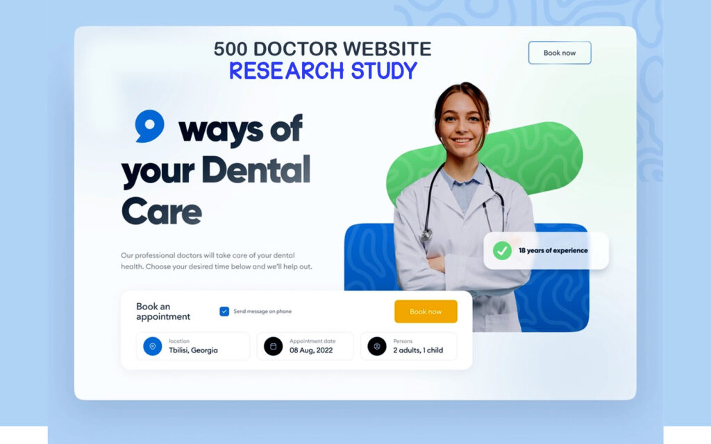
Our Proprietary Web Design Standard Guidelines
The survey considered 500 dental websites from five countries, including South Africa, Canada, Australia, the USA, and Japan, to judge them based on the nine web design checklists.
The study found out how many of these features were followed by those dental websites. We have indeed collected from the dental websites. But similar specifications apply to all other websites catering to businesses, consulting, or services.
- Quality Website Images
- Poor Homepage Content
- SEO Optimized Web Pages
- Banner Sliders (on Home Page)
- Standard Pro Design
- Unclear Navigation Menu
- Mobile Responsive
- Clear Footer navigation
- HTTPS Security
1. Quality Website Images
The primary goal of any website is to bring more visitors and provide them with a satisfactory user experience.
High-quality images on a website play a crucial role in captivating the user’s attention. The quality of images depends on factors like their sharpness, relevance, and resolution ensuring that a pro graphic designer designed it and the website has not used any downloaded free images from the internet.
We found many images were not even relevant to the service offered by dentists.
A blurry picture can be challenging for the viewers to understand and takes away the delight of looking at it. It may eventually lead to less user interaction.
Moreover, a website must use relevant pictures in its articles. For example, a dental website must focus on accuracy for the graphics they use in its blogs, content and web pages.
At the same time, the loading time of the images must be fast as that ensures user satisfaction.
The data shows that among the total 500 surveyed dental web pages, only 5% have quality images.
In South Africa, where the study was conducted on 100 web pages, we found quality images on 20% of the dental websites. Similarly, in Canada, where the number of surveyed webpages was 100, 25% of webpages preferred having quality images.

Among 150 dental web pages in the United States, 15% provided high-quality images. Finally, 5% of websites use high-quality images in Japan.
However, the survey was conducted on 30 websites because only those were in English.
2. Websites Having Poor Home Page Content
The homepage acts as the front door of a website. Therefore, it is crucial for the website. A visitor is willing to spend more time on a website with high-quality home page content.
In most websites, we found the following trend on the home page
- Sliding Banners
- A section block of services
- Footer
It does not add any value to your visitor. Typically, your home page should explain the services you provide, benefits of working with you and the customer reviews of those who have availed of your service. Homepage bears the responsibility of leading the traffic. Therefore, you must optimize it aptly.
A well-designed homepage must have proper headings, subheadings, infographics, navigation, content offers, deals, and other important information that a visitor seeks as they come to the Homepage of your dental website.
Our study on 500 websites from South Africa, Canada, Australia, the USA, and Japan, showed that 24% had poor Homepage content.
Our research showed that out of a total of 100 websites in South Africa, 34% had Homepages, not up to the mark. For Canada, we considered 100 websites, and 20% had low-quality Homepage content.
The study showed that 15% of Australian dental websites have poor Homepage content, with data collected from 100 websites. In the USA, we surveyed 100 dental websites, and about 20% had poor Homepage content.
A total of 30 Japanese websites were studied to find that 14% had bad-quality homepage content.

3. Websites Using SEO-Optimized Content
SEO stands for Search Engine Optimization and is a factor that helps a website get a higher rank in the search engines.
We defined SEO-optimized content with three basic rules
- Website URL structure
- Clear Headings and Subheadings (H1/H2)
- Keywords on body content
Not many websites were meeting our metrics to be qualified as SEO-optimized web page
When your dental website uses SEO-optimized content, its visibility increases to those using search engines to look for services. SEO plays a master role in driving good quality traffic to your website, which increases the opportunity of getting more bookings.
The study we conducted on 500 dental websites in South Africa, Canada, Australia, the USA, and Japan, found that only 23.4% of websites have SEO-optimized page content.
The survey examined 100 websites in South Africa to spot 30% SEO-optimized sites. This percentage is 15% in Canada, where we studied 100 websites. Among 100 Australian dental websites, 20% of sites are properly SEO-optimized.
In the USA, 25% of websites have SEO-optimized content, where we collected data from 150 websites. For Japan, the data collection was from 30 websites to show that 12% of them have SEO content.

4. Websites Using Banner Sliders (Bad User Experience)
Banner sliders often lead to poor user experience. The sliding images do not allow readers to read the text. If your readers can’t understand your offerings within 5 seconds of landing on the website, they are going to press the exit button.
Banner sliders are considered a design trend by web experts. In reality, it fails to communicate your important information with your visitor within 5 seconds. Sliders move faster than your visitors are able to absorb the info.
We have seen, animations distract your visitors from their goals, but sliders are the worst
We are sure, you will not want that!.
Your effort should be to make things easy and simpler to understand.
You should make them comfortable. Now, let’s see what our survey tells us. Do other dental websites use that many banner sliders for their web page?
We conducted a study on 500 dental websites in five countries. It included South Africa, Canada, Australia, the USA, and Japan and identified that only 8% of websites used standard banner sliders on the homepage.
Among 100 websites in South Africa, 25% maintained banner slider standards on the homepage of their website.
The survey collected data from 100 websites in Canada, and the research showed that 30% of them added apt homepage banner sliders. Similarly, 15% of dental websites from Australia used standard banner sliders, where a total of 100 websites were studied.
In the USA, we examined 150 websites and found that 22% maintain banner sliders standard on the homepage. We researched 30 Japanese dental websites for the survey to see 16% with standard banner sliders on the homepage.

5. Pro-Web Design Approach
Anybody can design a website nowadays, but amateur websites can harm the brand image. A professionally designed website creates the brand’s first impression to the visitor. At the same time, it helps to establish the website’s credibility.
We defined Pro-design approach with three basic rules
- Solid Copywriting
- Custom Graphics
- Website Color Schemes
- Clear Call-to-Actions on every page
An expert web designer can suggest strategies to help you with an engaging dental/or service business website and provide your visitor with a satisfactory user experience.
A pro design can help your website differentiate from the competitor’s cookie-cutter design mindset. An attractive web page can compel your visitor to navigate and propel them to book a meeting .
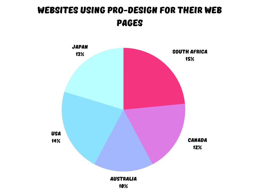
The survey of 500 dental websites in South Africa, Canada, Australia, the USA, and Japan, shows that 10% are designed professionally. Out of 100 websites in South Africa, we found that 10% of them had pro-designed web pages.
Among 100 websites in Canada, 12% are designed professionally.
The study looked into 100 dental websites in Australia to identify 10% of them with pro-designed web pages. The percentage is 14% in the USA, where we surveyed 150 websites. When we reviewed 30 Japanese websites, we found that 13% of the dental websites had pro-designed web pages.
6. The Websites With Poor Navigation Menu!
A website’s navigation menu has a massive impact on its conversion rate. If a navigation menu lacks an apt design, your visitor might lose interest in your services and exit.
Moreover, you should know that easy navigation helps in finding information on the website and browsing effectively. The website must coherently construct its navigation system to help the visitors land on their desired page within three clicks.

Image Source: Grundyhome.com blog
A visitor can be transformed into a potential customer only when they have a chance to explore.
Without an explicit navigation menu, with services offered, blogs and offers, your customer might not feel enthusiastic scrolling through the website.
Streamlining the navigation bar can be highly helpful for a website seeking to increase its conversion rate.
When a total of 500 dental websites in South Africa, Canada, Australia, the USA, and Japan were scrutinized, we found that 5.2% of them had unclear navigation menus.
Among the 100 websites in South Africa, 6% of websites were with poorly designed navigation menus.
The study showed that 4% of Canadian websites had an unclear navigation menu. In Australia, only 5% of websites have poorly designed navigation.
Remember that we collected data from 100 websites. The study scanned 150 websites from the USA to find 7% of them with transparent navigation systems.
We checked 30 Japanese dental websites. We found that 3% lacked an apt navigation menu.

7. Websites with mobile responsive feature
Visibility plays a crucial role in a website as they bring visitors. Thus, having mobile-friendly features is highly rewarding for websites. About 53% of users open websites on their cell phones and tablets. The percentage is higher when compared to those who accessed the websites on their desktops.
We are glad all the websites passed the mobile responsive feature test. Thanks to the rise of CMS platforms such as WordPress, that follows most of Google guidelines for an effective website.
Besides being helpful for website SEO and customer-friendly, mobile-responsive websites also create a positive brand image for your customers. A highly functional mobile-responsive website ensures customer engagement with the website since most people visit a site through their phones only.
The study conducted on the dental websites checked for their mobile-responsive features. The information collected from 500 websites in South Africa, Canada, Australia, the USA, and Japan, showed that 100% of the websites had mobile-responsive features. The data also revealed that 100% of South African dental websites are mobile-responsive.

8. Impactful Footer Design
Just like an attractive web design, putting a website footer is also impactful for the user experience. The website footer informs the visitor they have reached the end of the page.
We are glad all the websites passed the clear footer design test. Moreover, it serves as a tool to improve user experience. It also clears the navigation path, leading the user to their destinations.
It is essential to keep the footer clean and readable to get an impactful footer. You must add only selective information to the footer. A website might use privacy policy, legal statements, and links to service pages. You can also add an impactful Call to Action at the website’s footer.
A piece of location information can be a part of the website footer to make it impactful.
We had a study on 500 dental websites from South Africa, Canada, Australia, the USA, and Japan. We found that 100% of them used a website footer. The singular percentage of website footer usage for all the countries was 100%.
![]()
9. HTTP Secure Websites
More than 46 million websites use SSL by Default in 2021.
Most internet users understand the issue of their data being leaked to someone and the potential harm that can come from this. HTTPS security does not allow intruders to get the data a user shares on a website. The S in HTTPS indicates a Secure Socket Layer certificate, and the data is encrypted while it is passed on from the browser of a user to the website’s server.
We are glad all the websites passed the HTTPS secured certificate test. If your web visitor sees a “not secure web pages” tag, it gives a doubt in their mind and immediately a distrust may occur.
Any unprotected HTTP can reveal sensitive customers’ data, retain their browsing history, and can get a possible idea about their buying tendencies. Thus, Google differentiates HTTP from HTTPS websites with a red mark as “not secure.” Therefore, websites prefer to use HTTPS encryption to stop data piracy.
The survey on 500 dental websites in South Africa, Canada, Australia, the USA, and Japan showed that 100% used HTTPS security enabled web pages.

Conclusion/Final Takeaways
I hope you find this research study meaningful and will be able to implement some points to make your service website better.
A website needs to be designed strategically to bring in more visitors and provide visitors with a satisfactory user experience. Dental websites aiming to increase leads and appointments must take care of the quality of content, graphics, SEO optimization, and user-friendliness of the website.
Your customers will be interested in further communication if they find a website genuine. Therefore, you must secure a website for the customer to have a satisfactory user experience.
If you need help in redesigning your dental doctor website, I am happy to help you get started.
Share
