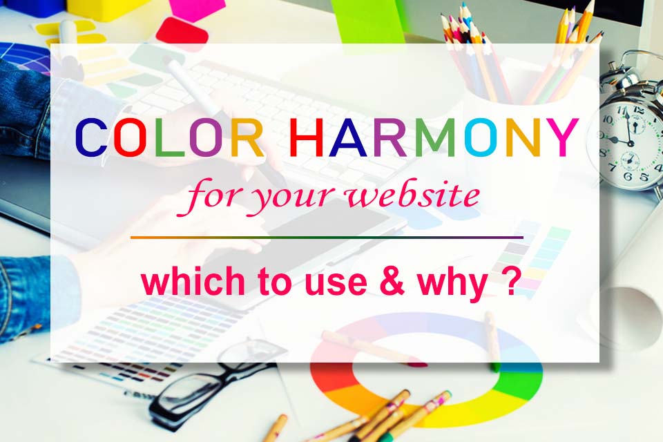
- Web Design Tips
- 07-10-20 09:51
Your website’s design is great. The content is top-notch and spot on. But if your website’s color combinations are like a kid’s color palette, your business is in deep trouble.
Unlike the way it sounds, choosing your website’s color palette is probably the most important decision you have to make. From the logo to the graphic designs to the actual content, they all have a certain color combination.
The best website color scheme helps your business stand apart. Choose the wrong one and your website is under deep murky waters. You don’t want that which is why I have compiled this guide to help you pick the best color combination for your website.
Does color combination for your website matter?
Imagine you have a landing page for your restaurant.
You design the website yourself even though many recommended not to design with a DIY website builder.
But for the past three months, your traffic didn’t increase and your business remained stagnant. A restaurant not making a profit amidst this COVID crisis means you need to make serious adjustments.
So what could be the problem?
Either you could have a poor logo that has no color coordination at all. Your cover image does not pop out from your background, hiding it from your customers. Your navbar is not helping your customer with navigation and your buttons are buried within your website.
Do any of these problems seem familiar?
If yes, you are following a poor color scheme for your website.
4 truths about crafting the website color scheme
Colors create the brand image

Cartoon Network still maintains the black and white combo even after changing their logo. Coca-cola after all these years still holds the signature red color.
When people say McDonald’s, it is the yellow M in the red background.
Could you imagine these brands in a different color pattern? Definitely not.
A random color turned out to be the identity of the business itself. That is the thing about colors; they help your business get its identity in the market.
Everybody would discard it altogether when they see the logo on the left. The red and yellow is synonymous with the brand value and without it, McDonald’s is nothing.
Colors establish a reputation

That 31 might be just a number for us but for BaskingRobbins they have perfected this marketing strategy and have now evolved into a business with its own reputation.
The colors perfectly go together, representing a premium quality that is better than its competitors. A blue monochrome would still look nice but the message dies. The right addition of pink gives their marketing message, promoting their name in the market.
Color speak your business intentions
Do you have a product to sell? Are you a new outlet like Washington post? Are you handling a forum for high school students on carpentry?
Even if you pick the perfect website color scheme, you cannot build websites for all three businesses.
That is because the intention of the three websites is different. They are like apples, oranges, and watermelons. Distinct, unique, and serve specific purposes.
When you understand color psychology, you will find different colors are used on very specific occasions.
The “one-size-fits-all” approach does not work while choosing the color combination for these websites.
The right color scheme multiplies sales
The website color scheme you choose depends highly on intent and your business needs. Using weird colors only makes your website unappealing to your customers.
Take the case of an insurance company.
What you need are colors that represent security, trust, and the feeling of being safe. Colors like red, or shades of black will put the website out of its real intention.
On the other hand, online stores use a mixed color scheme on their websites.
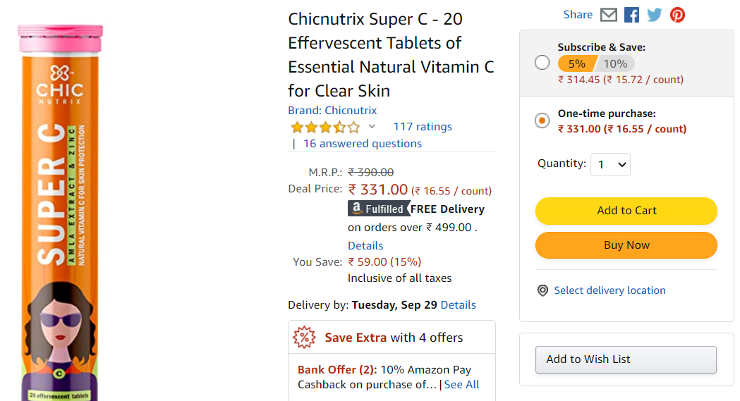
Here is an illustration of how multiple colors can be combined as an effective strategy. Orange in the buttons “Add to cart”, “Buy now” and the subscriptions pushes the customer to make an urgent move. This not only boosts sales but retains the customer in the long term.
How To Choose The Best Color Combination For Your Website
Okay, now you know the whys and it is time to help you pick the best color scheme for your business website.
Follow a hierarchy in your color scheme
If you have multiple colors in mind for your color combination, put them in order. Studies on Adobe Kuler shows businesses decide on a color combination that consists of 2 to 3 colors.
How can you arrange these 3 colors to build a stunning color combination for your website?
The most preferred color is your dominant color. This could be the color of your logo or one that goes along with it.
Your dominant color is the center of attraction from where you can construct your secondary colors.
- Complementary selection where you choose the opposite color of your dominant color like Yellow and Purple.
- A monochrome color pattern where your color palette consists of different shades of the dominant color.
- Triad that contains three evenly distributed colors from the color palette.
Along with these three popular color schemes, you can create a new combination yourself. Visit Adobe Colors to get insights on how to choose color combinations for your website.
Put the audience first and build a suitable color scheme
You put so much effort to produce top-class content and web design for your audience.
Why do you overlook the color scheme of your website when it comes to building a solid following?
You might love red but does it go hand in hand with your insurance company? Not really and you don’t want your personal preferences sending your business downhill.
Three important factors while deciding your website’s color scheme based on your visitors are:
Gender
This might sound trivial but men and women have distinct color preferences and change as they age. The differences were significant where men and women leaned towards cool colors of blue and pink respectively.
Age
From toddlers to teens to elderly people, their product preferences vary and so do the colors they prefer with them.
It is rare to find people in their teens looking for banks, insurance, and pension options online. Similarly, websites on gaming, tech accessories, and theme parks don’t get attention from older people.
A study from Taiwan shows young teens prefer colors of fun whereas the elder people chose colors of comfort.
Demographic distribution and culture
People from different countries perceive colors differently which is why your audience’s demography matters.
Colors represent emotions and emotions are strong. Western and Eastern cultures have different colors that mean different emotions.
The best color scheme for your website must find a sweet spot on the color palette that satisfies all three of these factors.
Choose images that match your color scheme
What do a graphic design company, photography business, and an online clothing store have in common?
High-quality images. A lot of them.
The color palette of the images and the element colors in your website must be complementary. This is the iron rule you shouldn’t forget.
Here is how an image should be complementary to your website’s color scheme:

Getting the right image or graphic design to match your color combination is not an easy task. I suggest you visit Behance to find stunning web designs with exquisite color combinations.
Even if you can’t get the actual color coordination in the image, it is not a big deal.
With a few touchups in Photoshop, adjusting the levels, brightness, and contrast, you can still rock that cover image on your landing page.
Make elements in your website stand out
You saw why your cover image has to stand out on your website. But so should your calls-to-action and sign up buttons because they bring actual sales and revenue to your business.
How can you make small buttons pop up and catch the attention of your visitor?
Neutral colors to the rescue
Black, white and gray. These are the new white-spaces.
Whether it is text, buttons, navbar, or the background color, you have to help those elements pop out. Adding neutral colors enhances better than going for a shade of your dominant color.
A pro-tip would be tip design neutral-colored logos that pop better in banners and infographics than the original color.
Website’s background-color
Your website’s background color is often overlooked. When you hang a picture on your wall, the wall color enhances the picture.
That is the same as the content on your website. The ideal background color is one that enhances the value your business offers to your visitors.
Stay consistent with your designs and color scheme
You might bump into new website color scheme ideas and feel you could do better with the color combination you are currently following.
But the right color scheme is like investing long term. The benefits will reap in the future when you stick with it.
Maintaining consistent use of colors in the graphic design, buttons, backgrounds resemble a stable and authentic business. This brings in and retains customers in the long run.
Your website’s color scheme will become the identity of your business, sooner or later.
To sum up your website color palette
Although you have resources to figure out the best color combination for your website, why not leave it to the professionals?
Reach out to a qualified web design company like Gyan Devign Tech Services. Your business idea needs a website to be online but before it has to be perfectly designed.
Are you ready to take your website online?
Have a call with our team to understand the nuances of website design and pick the best website color scheme now.
Share

Rahul Gulati
Rahul Gulati is a founder and a web strategist at DevignTech. He helps small businesses make professional websites and apps that follows minimalist design approach. To tune up your small business website, contact him on rahulg@sandybrown-ram-249399.hostingersite.com or reach out on Linkedin