Launching a new business online is tough—statistics show most startups don’t make it past the first few years. But a well-designed website can be your competitive edge, helping you attract customers, build credibility, and drive growth. The key is to avoid common design mistakes and focus on what actually works.
Why Your Website Matters More Than Ever
-
Businesses with a strong online presence see an average revenue increase of 23% compared to those without a website.
-
Over 50% of users now access websites from mobile devices, making mobile-first design essential.
-
Websites with intuitive navigation experience a 61% boost in user satisfaction and a 37% drop in bounce rates
Human beings are visually enhanced creatures. We like attractive things. Too many unrelated ads, junk content, and a bad color combo do not make a website attractive. Visitors don’t appreciate it and you don’t want to ruin your business in the long run.
If your business is new, consulting an expert web development company in Pune would be the best thing. You will find tips that are helpful in designing a website’s layout in this article.
How bad website design hurts your business
Arngren, a Norwegian electronics company is not only outdated but also has all the negatives of a website. Their website is filled with clutter, making it difficult to navigate through the article. Their bizarre fonts would make anyone switch pages instantly.
If you are reading this, you are probably having a business idea to invest in. You want to design a website that is on point and meets your expectations. We list the common web design mistakes of the year and how to avoid them at all costs.
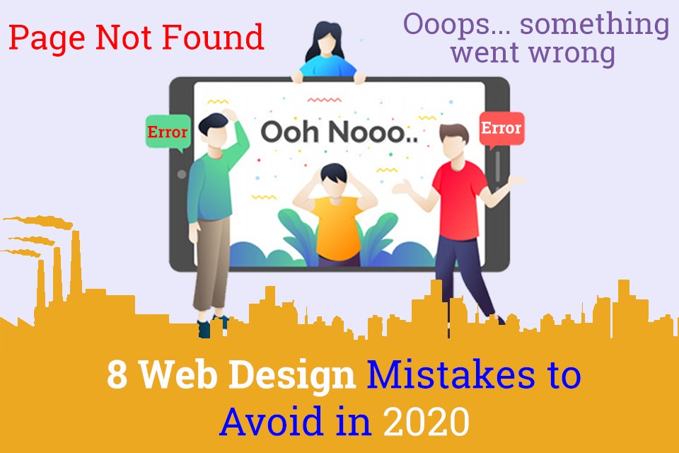
8 Red Flags Of A Bad Website Design To Avoid 2024
Imagine you go to a website and find plain text in it. What will be your impression of their business?
A good content structure is as important as designing the website in the first place. The biggest turnoff for your customer is when they find your business name in an immature font like Broadway. According to a 2024 study by Adobe, 73% of online visitors will leave your website if your content is unengaging or too lengthy. Today’s users expect concise, visually appealing, and interactive content—nobody wants to scroll through endless blocks of text.
Color schemes matter a lot. The best color pattern can accentuate your website but flashy colors and unattractive patterns are a big no.
Do you know what annoys a visit the most? Websites that are not responsive and mobile-friendly. 57% of users say they will not recommend a website that is not optimized for mobile phones. 54.8% of web traffic comes from mobile users this year.
The answer is simple: make your website mobile friendly with a responsive design.
Pro-tip:
To rectify these problems you can follow these website design tips that provide a good content structure.
Your language should stand out as it is completely unique to you. Follow a clear hierarchy so that it guides your visitor through your website. In a nutshell, hierarchy reduces complexity.
Website security directly impacts your customer base. I mean think about it: Why would a customer make a transaction knowing that the website is not secure? Having a site liable to external attacks and threats will not be trustworthy.
A regular HTTP website cannot assure the customer that the data remains confidential. If not the technical aspects, your visitors look for the padlock icon in the browser when loading your website.
Secured websites are authentic and Google lets you know that. Google marks those HTTP websites as “not secure”, signalling the visitor that the website is not trustworthy.
Pro-tip:
While designing a website for your small business, make sure it uses TLS protocol for security. With a HTTPS website, details regarding a transaction or a registration will remain secure.
With over 40 hours a week of screen time, your visitor meets a lot of businesses like you and you need to design a website that keeps them engaged with you.
Catching their attention is important and you have to be different from the rest of the crowd. Your website should be designed in a way that people do not skip.
Unlike conventional business, a customer lost in the online market is always a customer lost. Visitors scan about 28% of your content so the content must be designed in a crisp and concise format.
Evoulve has a minimal design with crisp content and it works perfectly! You just need to find the sweet spot by managing media and content on your page.
Here are some tips for a better layout: Use of a featured image on the home page. While designing a website layout, make sure it reflects the exact theme of your business. Use white spaces wherever necessary. It helps in better comprehension.
Once people go through your content, they need to be directed properly. Typically, a visitor expects a piece of content or a newsletter subscription at the end of the page.
The footer must be designed in a way that it guides the user to your portfolio and related content.Apart from contact details and copyrights, site navigation links are mandatory in your website’s footer.
Another important one you cannot miss is a Call to Action.Calls to Action are like sign boards to direct your visitors where you want them to go.The impact that CTA produces varies with where and how it is placed and not having them can hinder the business’s longevity.
Calls to Action have the ability to turn your visitors into possible customers. To ensure continuous engagement and to proceed with further processes, a call to action button in the footer is necessary.
If not designed right, footers have a bad impact on the relationship with your existing customers. Intel is a great example for having a simple yet powerful footer. A handy design advice would be to create links that are legible enough for the visitor to click and view.
Pro-tip:
Use the right colors for the right buttons. The phrases matter too. If your business is about booking tickets, try a CTA like “Plan your next journey here!” than “book” or “register”. Creativity always adds extra value.
Most people leave a webpage if it takes more than 3 seconds to load. Do you know why?
Unlike people who read long articles in newspapers or magazines, your visitor does not have time to go through all the content in your website. Otherwise, it is going to increase your bounce rate by multifold.
This time-starved millennial generation wants it short and precise.
If your website loads in 0.8 seconds, it means that you are ahead of 94% of your potential competitors. Websites that take a lot of time to load and respond, you lose visitors and potential customers.
Loading time or your site speed influences your website’s ranking in the search engine. Higher speeds result in better traffic making your website appear to a larger audience. Google also identifies that having a 1.3 seconds average load time for a responsive design is the best practice.
Pro-tip:
In order to optimize your site speed, follow these design tips.
- Compress the files and images in your website. This saves time and your website loads faster.
- Reduce HTTP requests generated by combining CSS and javascript files.
- Page caching also helps to avoid your browser sending requests every time you visit the same page.
- Having external stylesheets is better than inline CSS code.
- Also try to reference the HTML code to a single stylesheet which reduces the HTTP requests generated.
Your business is growing and people love it. What is more helpful than your customers sharing their own experiences themselves?
Case studies are proof that your products stand out and people have witnessed it themselves. Although they take time to write, they seldom go outdated, resulting in conversions for a long time.
According to the Demand Gen report 2018, case studies catch more views as 64% respondents share with their colleagues.
Missing out on case studies is not a good idea, especially if your business has developed over the years. Your business has a story to tell and designing a website with case studies improves reliability over your business.
Pro-tip:
A video, an interview or even a quote; they communicate with your visitor in one way or the other. Structure a story and place it either on the homepage or the sidebar for maximum impact.
When you find websites playing around with multimedia and embeds, plain text will be boring. Obviously!
Images and videos are so common that almost all the top websites have them. From there, you can add a newsletter for your visitors to sign up.
If you have a paid web app, why not offer a free trial? Chat bots are super common and customers find them helpful.
Can you see how you can convert a boring website to something that can actually perform?
When it comes to images, rookies use stock images from open source platforms. This shows your business lacks authenticity which could reduce traffic. It is better to use your own photos and videos than the copyrighted ones.
Nobody likes ads. Period.
People now hold on for that 5-second ad to go away on YouTube. Now imagine your website with multiple ads popping up and flashing on either side, who would want to stay?
Check out JournalDev. Their content is awesome. No doubt about that. But there’s a video that is constantly playing with ads flashing on both sides.
Google always prefers websites that offer top content and will not encourage websites that are filled with ads. Refer to their ad placement policy to get a deep perspective. In the meantime, keeping your white spaces to a minimum helps.
To conclude on a positive note, you can turn things around in your favor if you keep the above factors in concern. If you find any of the traits in your website, remember your traffic gets a big blow every single day.
If you feel we have missed any point, do let us know your thoughts or you’re considering redesigning your website, contact us for a healthy discussion.