
In today’s fast-paced digital world, small and medium-sized businesses (SMBs) are feeling the heat to keep up with the competition. With everyone glued to their phones, having a killer website that looks great on all devices isn’t just a nice-to-have—it’s a necessity! As mobile devices account for over 58% of global website traffic, businesses that fail to optimize their sites for mobile users risk losing a significant portion of potential customers.
A responsive WordPress design is the secret sauce for SMBs looking to boost their online presence and sales. It automatically adjusts your site’s layout to fit any screen size, which means no more pinching and zooming for your customers. When your site is easy to navigate on mobile, you keep visitors engaged longer, reduce bounce rates, and ultimately drive sales.
So, if you’re an SMB owner wondering how to elevate your business in this digital age, stick around! We’re diving into the nitty-gritty of WordPress mobile optimization and how a responsive web design for WordPress can be a game-changer for your sales strategy.
1. Understanding WordPress Mobile Optimization
WordPress mobile optimization is all about making sure your website looks great and works well on smartphones and tablets. You can start by using responsive design techniques to allow your site to adapt to various screen sizes and resolutions. You may now ask, “What is a responsive design?”
A responsive web design for WordPress ensures that your website provides a seamless experience for users, regardless of whether they are using a smartphone, tablet, or desktop. It ensures that visitors can easily navigate your site, read content, and interact with it without any fuss. No one wants to pinch and zoom just to see what you have to offer!
2. The Rise of Mobile Usage
The trend towards mobile browsing is undeniable. According to Statista, mobile devices generated 58.67% of global website traffic in 2023. With more people glued to their smartphones than ever before, having a mobile-friendly website is a must-have for an SMB.
When it comes to ranking higher in Google searches, WordPress mobile optimization is your ticket to the top. You need to be at the top of the search results to outshine your competitors. Google is all about giving users the best experience, and that means favoring websites that are easy to use on mobile devices. You have to make your site mobile-friendly if you want to climb the search engine rankings.
3. Benefits of Responsive Web Design for WordPress
#1 Enhanced User Experience
Imagine cruising through a website like a breeze, finding what you need without any hassle—that’s the magic of enhanced user experience with responsive web design for WordPress. Whether you’re on a smartphone, tablet, or laptop, the site adapts to suit your screen size. No more squinting or endless scrolling; it’s all laid out perfectly for you. With quick loading times and seamless navigation, users stick around longer, exploring your content with a smile. A positive user experience is crucial; studies show that 88% of online consumers are less likely to return to a site after a bad experience.
Let’s say someone checks out your website on their phone and finds it hard to navigate or it takes forever to load, they won’t be impressed. They will head over to a competitor and might never visit you again!
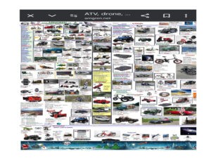
Source: Arngren
A bad mobile experience can cost you, visitors, and potential customers. Take a look at Arngren’s website. The layout looks like an old-school yellow page. When I first landed on the site, I was hit with a navigation maze. The site feels even more cramped on a smaller screen like a mobile. The design doesn’t really adapt well, so you end up pinching and zooming just to read stuff.
I found myself accidentally clicking on the wrong links because things are so tightly packed together. This made me lose interest and leave the page even though there was some interesting content on Arngren.
This website needs a makeover ASAP. First off, the layout definitely needs a redesign. A clean, modern design with plenty of white space could work wonders. It would help to breathe a little life into the site and make everything feel less cramped. How about organizing content with a grid system? It can help to organize the content better.
Now, onto navigation. A simple, intuitive menu at the top of the page would make it way easier for users to jump around. Consider a sticky menu that stays put as you scroll down.
Content organization is your next stop. Grouping related information together and using headings or bullet points can help users digest the info better. You can also add a search bar to make it quicker to find things.
Lastly, let’s not forget about mobile optimization. It is crucial to have a responsive design that adapts nicely to smaller screens. This means larger buttons that are easy to tap and text that’s readable. Maybe even throw in some videos or animations to keep things lively!
#2 Improved SEO Performance
You want Google to be your best friend, right? Well, a responsive web design for WordPress can make that happen. Search engines love mobile-friendly sites, and they reward them with higher rankings.
With Google’s mobile-first indexing, having a mobile-optimized site isn’t just a bonus—it’s a must. Your local SEO efforts and responsive WordPress design will help you rank high in search engine results.
A study by Search Engine Land found that mobile-friendly sites receive 50% more organic traffic than non-optimized sites. By using responsive design techniques, you will make users happy and end up grabbing the attention of search engines. This will help to drive more traffic to your site. Plus, it boosts your online presence. So, it is a win-win all around!
#3 Increased Conversion Rates
Responsive web design for WordPress can be a game-changer for your conversion rates. Picture this: a user lands on your site, and everything looks perfect on their mobile screen. They find what they want quickly, the buttons are easy to tap, and the checkout process is a breeze. It’s like a dream come true for them, and what do they do? They convert!
According to a report by Adobe, mobile users are three times more likely to make a purchase on a mobile-optimized site than on a non-optimized one. With a responsive WordPress design, you are not just attracting visitors—you are turning them into customers.
4. Case Study: JustThrive’s Mobile Makeover

Meet JusThrive, a health supplement company that decided to shake things up by investing in a responsive WordPress design. Before the makeover, their website was cluttered and confusing, making it hard for visitors to make purchases, especially for auto-ship subscriptions, causing frustration and driving customers away.
Their product pages were overwhelming, much like a buffet with too many options.
But after embracing the responsive design on their site, their wordpress website got a makeover. They streamlined product images and added white space for a cleaner look.
They replaced social media icons with trust signals like a 30-day guarantee and secure payment icons, reassuring customers during checkout. They emphasized the auto-ship option with a “Best Value” button and highlighted free shipping. The result? JustThrive’s mobile optimization transformed their website into a conversion powerhouse. They had an increased conversion rate of 25.4% and their auto-ship subscriptions increased by 41.5 %.
They had a 53.73% increase in the total number of orders Customers found shopping a breeze with smoother navigation and lightning-fast loading times. The case of JusThrive showcases the concrete benefits of diving into WordPress mobile optimization, it’s not just about looking good; it’s about driving traffic, boosting sales, and keeping customers happy.
5. Best Practices for WordPress Mobile Optimization
A responsive web design for wordpress can do wonders to your SMB. Now that you are ready to start your WordPress mobile optimization journey, you are on the brink of unlocking a whole new realm of possibilities! Let’s dive into some of the best practices to be followed for WordPress mobile optimization:
- Use a Responsive Theme: Choose a WordPress theme that automatically adjusts to different screen sizes. Themes like Astra or OceanWP are popular choices for their responsiveness. When you use a responsive theme, all the text, images, and buttons rearrange themselves nicely so that everything is easy to read and click. Your visitors can find what they need without feeling like they’re on a treasure hunt.
- Image Optimization for Speed: Large images can slow down loading times. Resize and compress those images like you are packing for a road trip; the lighter, the better. Use image compression tools like TinyPNG or Smush to reduce file sizes without sacrificing quality.
- Easy Peasy Navigation: Simplify your menu and navigation like a well-marked hiking trail. Users on mobile want to find what they need quickly, so make it effortless for them. Think big, clickable buttons and intuitive gestures that guide users seamlessly through your site.
- Minimize HTTP Requests: Reduce the number of elements on your page to decrease loading times. Each plugin can add extra requests, so try to stick with only the ones you really need. Instead of having a bunch of separate CSS or JavaScript files, you can combine them into one. You can also defer the loading of JavaScript to set certain scripts to load only after the main content is displayed. This way, users can start seeing your site while other stuff is still loading in the background.
- Implement Lazy Loading: The lazy loading technique loads images and videos only when they are about to be displayed. You can think of lazy loading as being smart about how your site serves up content. Less waiting, more scrolling! Who wouldn’t want that? You can use plugins like WP Rocket or Lazy Load by WP Rocket that make this process a breeze.
- Streamline Content for Clarity: Mobile screens are precious real estate, so make every word count. Keep your content concise and to the point, like a good story that doesn’t drag on. A clumsy site will confuse your customers, trust me you won’t want that to happen. Your visitors will most likely convert if your site has clutter-free pages with clear calls to action.
- Test Your Site: Before you unleash your website into the wild web universe, it’s crucial to give it a test drive on various devices and browsers. Use tools like Google’s Mobile-Friendly Test to assess your website’s mobile optimization and identify areas for improvement. Trust me, a little testing now can save you from a lot of breakdowns later on.
6. Common Challenges and Solutions
Now you are fully aware of the benefits of WordPress mobile optimization and you are ready to implement. As an SMB you might face some challenges when implementing it. No worries, I got your back. Let’s jump into some common WordPress mobile optimization issues and their solutions:
-
- Slow Loading Times: Mobile users expect fast loading times. If your site takes ages to load on mobile, you will be losing impatient visitors along the way. Switch up to a better hosting provider or use a Content Delivery Network (CDN) to improve speed.
- Navigation Issues: Small screens can make navigation tricky. Simplify navigation with clear menus, sticky headers, and prominent calls to action. Ensure that buttons are large enough for easy tapping and that menus are simplified for mobile users. Use intuitive gestures like swipe and tap for easy interaction on touchscreens.
- Incompatibility with Mobile Browsers: Some elements might not show up right, or buttons could be unclickable when viewed on different devices or browsers. Test your site across multiple devices and browsers to ensure compatibility. Tools like BrowserStack can help you identify issues. You can use polyfills to add missing features for older browsers.
- Text Legibility Issues: If your text is too small or the contrast is weak, good luck getting anyone to stick around and read your stuff. Use relative units like percentages or ems for font sizes to ensure readability across devices. Test font sizes, contrasts, and spacing to guarantee comfortable reading experiences.
7. Conclusion: Making the Investment Worthwhile
If you run an SMB and haven’t embraced mobile optimization yet, you are missing out! Everyone’s glued to their phones, so making mobile-friendly sites will win customers.
Think about it: a responsive design makes it super easy for users to browse your site, find what they need, and make purchases—all from the palm of their hand. This not only enhances the user experience but also boosts your SEO rankings, which means more visibility for your business. Plus, a smooth mobile experience can skyrocket your conversion rates; when shopping is easy and hassle-free, people are way more likely to hit that “buy” button. And let’s be real, happier customers mean repeat business! Investing in WordPress mobile optimization pays off in the long run.
Your customers and your sales team will thank you. So, if you want to stay competitive and keep those sales rolling in, prioritizing mobile optimization is the way to go. Trust me, it’s worth every penny.
At GyanDevign Tech Services, we understand the crucial role that WordPress mobile optimization plays in driving business success. By choosing us, you’re not just investing in a website—you’re investing in a seamless user experience, enhanced visibility in search engines, and higher conversion rates.
Don’t let your business get left behind in the mobile revolution. Join hands with WordPress development company Canada, and kick-start your WordPress mobile optimization journey together