An increase in conversion rate, especially on an e-commerce website, entirely depends on how your customers feel while landing on your portal. Your entire website should focus on design, user-friendliness, product images , descriptions, CTA, checkout process, getting product reviews and security protocols to make your website a favorite stop-shop for customers.
Business development strategy for your new ecommerce website is something you must know to scale up your business.
However, when you think about customers’ journey on your website, you must put yourself in their shoes to know their pain points. Today, the emergence of many e-commerces stores in the market has flooded the market, and this has reduced customers’ patience level. They want your website to meet their expectations; otherwise, they have many more e-commerce portals to shop.
Best practices to design your ecommerce website for more conversions
Let us explain the key determining factors to increase ecommerce website conversions.
1. Clear Call to Action (CTA)
Make your CTA crystal clear. Most e-commerce websites use ‘Buy now’ or ‘Add to basket’ buttons as CTA, which grab buyers’ attention and let them know that this option will drive them towards payment options. CTA buttons are always contrasted in colors to keep them highlighted.
Here, let’s take an example of a leading brand ‘Oriflame’ with its headquarter in New Delhi.
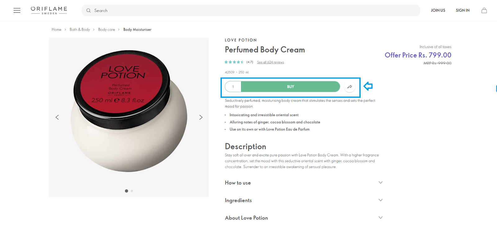
Here in the above image, the entire page of Oriflame product description is white in color, and they have highlighted the CTA option in the green color, to differentiate it. Such differentiation clearly lets the customers know that they need to click on it to navigate to the payment details page.
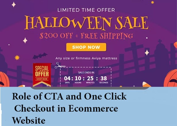
2. Create urgency for shopping
Offer discounts for a limited period; give your customers a coupon code that may expire after a few days. All such aspects will compel buyers to make urgent buying decisions to save some money.

In the above image, FirstCry mentioned a limited ‘rush hour sale.’ Such offers allow buyers to use the coupon code and shop within their budget.
3. Keep the checkout procedure simple
Customers love the short and sweet processes. Allow your customers to do one-click checkout by avoiding the ‘Add to cart’ option. It will allow customers to check out quickly while remaining on the product page only.
Even if one-click checkout is impossible, try to streamline your process to avoid buyers’ abandonment. Buyers hate to provide too much information on the portal to buy any product, especially if they are signing in for the first time on your portal for a purchase.
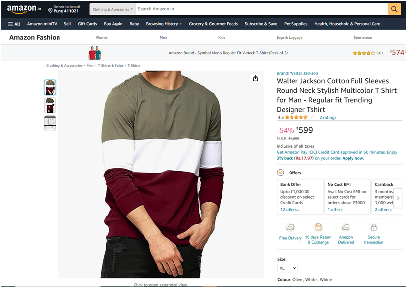
4. Offer different payment methods
Today, different payment options are available, which includes credit or debit card, UPI, QR code, net banking, digital wallets, etc. Ensure that you offer all the payment options to your buyers. That will increase their convenience, and they can choose the most suitable payment option.

In this image, you can see the different payment options Amazon offers. Usually, most e-commerce portals provide all such payment options, and you must include them on your portal.
5. Put customer reviews at a suitable place
Think from the customers’ point of view. Where would you love to see previous customer reviews for a particular product? Yes, you got it right! On the product description page. It is the page where you would love to know more about the product and the previous customers’ experience. Encourage your customers to give product reviews and put them on the product page to increase conversion.

Source: Amazon
Amazon has placed the customers’ reviews below the product display. Checking all the product reviews helps customers make buying decisions and boost your conversion rate.
6. Add Videos and HD Product Images
Allow your buyers to see an informative video about the product before purchasing. Such videos help them to know everything about the product and take a close look at it.
Also, ensure that you incorporate high-quality product images on the portal to win the customers’ confidence regarding that product. Include the zoom function in the product images for a closer look.

Source: Flipkart
Role of CTA on your e-commerce website
CTAs are the bread and butter of your website. It encourages visitors to take action and become a customer. Below are important benefits of a clear CTA.
- Reduce elimination fatigue: A crystal clear CTA will guide your buyers about where to go and what to do next.
- Give directions: CTA will minimize the possibility of your buyer to click anywhere else due to any confusion.
- Improve conversions: The more buyers you will attract towards CTA the more leads and prospects you will add in your business.
I will present some examples of companies here that have increased their revenue at a significant rate by changing either the position of their CTA button or the CTA content. So, let’s know about those companies and their respective changes in CTA.
Examples of strong CTA that increased sales
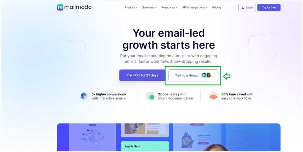
1. Website: Mailmodo
Mailmodo is a product and solutions-based company that helps its clients with email marketing. The company was experimenting with its CTA to enhance the conversion rate. Finally, they got an idea and changed the wording of their CTA, which improved their conversion rate by 2 times. They changed the generic wordings of their CTA from ‘Book a demo’ to ‘Talk a human.’
Tarun Agarwal, VP of Mailmodo, stated that adding a human touch to the CTA worked better for the company than using only transactional copies in the CTA.
In short, it is better to level up your marketing strategy by shifting your focus from generic CTAs to more interactive ones.
2. Website: Kommunicate
This brand helps companies with AI-powered chatbots. It has offices in India and the United States. Earlier, the company kept an email address box beside the ‘Try for free’ CTA. But later, the company realized that many customers hesitate to provide their email addresses, and they removed that field completely and wrote only the CTA, i.e., ‘Try for free.’
Such a change helped the company to increase its revenue by 25.5%. Such a change allowed customers to try the service for free without providing any personal details, and many customers clicked on that CTA, which earlier was afraid of doing so.
Before:

After:

Benefits of one-click checkout for Ecommerce Websites
One-click checkout reduces the buyers’ abandonment. Here I will let you know about two brands which have properly streamlined their checkout process to add convenience for the customers. Believe me; all such small yet effective things on your website can make a huge difference in the conversion rate.
1. Website: Chubbies Shorts
This US based e-commerce portal sells clothing accessories. This company website has presented a great example in the fashion sector.

The checkout page of this portal contains everything which a customer would like to know. This implies it contains the shipping options, and order summary. Plus customers can change the quantity, size and color of the product right from the checkout page.
An editable checkout page allows buyers to do last moment change. Also through this checkout page customers can sign up for text alerts, to remain updated about the order status.
2. Website: Mcaffeine
Mcaffeine sells a variety of products related to body, face and hair care.
It’s not only products which make the customers happy, it’s the checkout procedure too.

The company’s checkout page is different from others. Instead of opening a brand new page, it’s a tab that opens on the same page the customer is viewing.
This allows a quick checkout process and enables the customers to keep an eye on the product page during checkout.
Conclusion
Well! It might be a daunting task for you to redesign the website to make it more user-friendly. But as your complete business depends on buyers’ persona about your website, you must think a bit while designing the website. Consider below-mentioned points and you are done:
- Play with your CTA tab and check its placement and content to increase conversion rate.
- Product images should display products from every angle and include video which allows customers to take a close up look.
- Streamline your checkout process.
- Offer different payment options and keep the customer reviews at the checkout page.
Hope you got all my points! If you need help with ecommerce development services, do reach out and schedule a call with our experts